
Every few months, one chart sends financial headlines into a frenzy: the FOMC dot plot. It looks like a scatter of dots on a grid, yet investors treat it like a crystal ball for interest rates. So will the Fed cut rates in 2026? The honest answer lives inside those dots — and reading them correctly can change how you think about your bonds, your cash, and your stock portfolio.
This guide walks through what the dot plot is, what the latest one says about 2026 rate cuts, and — most importantly — how to use it without overreacting to it.

What the FOMC Dot Plot Actually Is
The dot plot is part of the Federal Reserve’s Summary of Economic Projections (SEP), published four times a year — in March, June, September, and December. It shows where each member of the Federal Open Market Committee (FOMC) thinks the federal funds rate should sit at the end of the current year, the next couple of years, and over the “longer run.”
There are up to 19 dots, one for each official, and they are anonymous. You cannot tell which dot belongs to the Chair. What you can see is the spread of opinion and, crucially, the median dot — the middle value that most analysts treat as the committee’s baseline forecast. When you understand how rate decisions ripple outward, the dot plot stops being abstract; it becomes a preview of the forces described in our companion piece on how Fed rate decisions affect the stock market.
What the Latest Dot Plot Says About 2026 Rate Cuts
At the March 18, 2026 meeting, the committee kept its target range at 3.50%–3.75% and updated its projections. The median dot for the end of 2026 came in at 3.4% — implying roughly one 25-basis-point cut over the course of the year, unchanged from the December 2025 projection (Source: Federal Reserve SEP / CNBC, March 2026).
Where the median dot sits
A median of 3.4% is the number markets fixate on, because it sets the tone for everything from mortgage rates to money-market yields. One cut is a modest, cautious path — far from the aggressive easing some investors had hoped for at the start of the year.
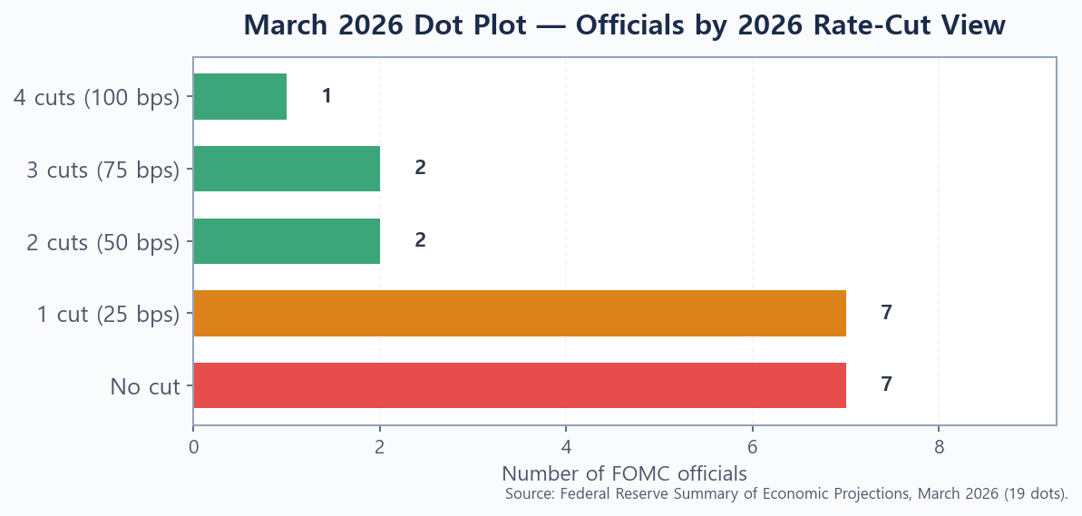
How much disagreement is on the committee
The median hides a wide range of views. Of the 19 dots for end-2026, seven officials saw no cut at all, seven saw a single 25 bps cut, two saw 50 bps, two saw 75 bps, and one saw a full 100 bps of cuts (Source: Federal Reserve SEP / BondSavvy, March 2026). That split — half the committee leaning toward “hold,” half toward “ease” — tells you the 2026 path is genuinely uncertain, not a done deal. A big driver was inflation: projected PCE inflation was nudged up to 2.7% for year-end, 30 bps higher than the December estimate.
The Median Projection Path Through 2027
The dot plot is not just about this year. The SEP also projects the path beyond 2026, which matters if you hold longer-dated bonds or are deciding how long to lock in today’s cash yields.
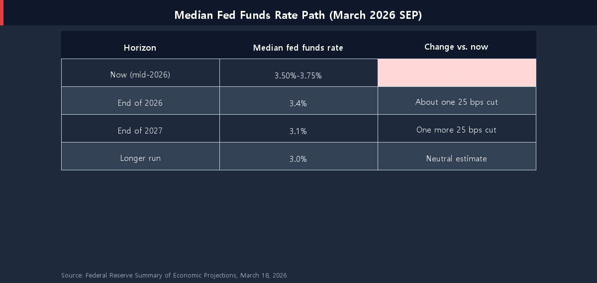
The median path implies one more 25 bps cut in 2027, drifting toward a longer-run “neutral” estimate near 3.0%. In other words, the committee sees rates grinding lower slowly — not a rapid return to the ultra-low rates of the past decade. If you are weighing where to park near-term savings, this gentle glide path is exactly why the trade-off in short-term bonds vs. high-yield savings is worth revisiting, and why income investors keep a close eye on the best high-yield dividend ETFs for 2026.
Why the Dot Plot Is a Forecast, Not a Promise
Here is the part most headlines skip. The dot plot is a snapshot of opinion on a single day — it is not a commitment. Each dot reflects what an official thinks is appropriate given today’s data. When the data changes, the dots change.
History is full of dot plots that aged badly in both directions: years when the Fed projected several cuts and delivered none, and years when it signaled patience and then eased quickly. The reason markets sometimes fall even on a widely expected cut is that the cut was already “priced in,” while the dot plot’s future guidance disappointed. So the lesson is not to trade on the dots, but to read them as a probability map — a sense of direction and conviction, not a calendar you can set your portfolio by.
How to Read the Dot Plot for Your Portfolio
You do not need to be an economist to put the dot plot to work. Use these steps to translate the dots into something practical:
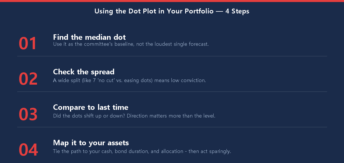
The goal is perspective, not prediction. A single dot plot should rarely trigger a wholesale change to a well-built plan. It is one input that helps you understand the “weather” your investments are operating in — which is why a durable beginner’s guide to asset allocation matters far more than any one Fed meeting. And if you are just getting started, the dots are a reason to begin, not to wait: you can start investing with only $100 and let a consistent plan ride through every rate cycle.
Conclusion: Watch the Dots, but Anchor to Your Plan
So, will the Fed cut rates in 2026? The latest dot plot points to about one cut, with a deeply divided committee and an inflation picture that could push that path in either direction. The median says “slow and cautious”; the spread says “stay humble.” Read the dot plot for its direction and its level of conviction, but let your own time horizon and asset allocation — not a chart of anonymous dots — drive your decisions.
This article is for informational purposes only and is not investment advice. Projections and rate paths can change; verify current figures with primary sources before making decisions.